Showing posts with label Index. Show all posts

Wednesday, September 27, 2017

How Our Multiple Cycle and Vibrational-Frequency Cycles Are Lining Up

A quick look at any of the US majors will show most investors that the markets have recently been pushing upward towards new all time highs. These traditional market instruments can be misleading at times when relating the actual underlying technical and fundamental price activities. Today, we are going to explore some research using our custom index instruments that we use to gauge and relate more of the underlying market price action.

What if we told you to prepare for a potentially massive price swing over the next few months? What if we told you that the US and Global markets are setting up for what could be the “October Surprise of 2017” and very few analysts have identified this trigger yet? Michael Bloomberg recently stated “I cannot for the life of me understand why the market keeps going up”. Want to know why this perception continues and what the underlying factors of market price activity are really telling technicians?

At ATP we provide full time dedicated research and trading signal solution for professional and active traders. Our research team has dedicated thousands or hours into developing a series of specialized modeling systems and analysis tools to assist us in finding successful trading opportunities as well as key market fundamentals. In the recent past, we have accurately predicted multiple VIX Spikes, in some cases to the exact day, and market signals that have proven to be great successes for our clients. Today, we’re going to share with you something that you may choose to believe or not – but within 60 days, we believe you’ll be searching the internet to find this article again knowing ATP (Active Trading Partners) accurately predicted one of the biggest moves of the 21st century. Are you ready?

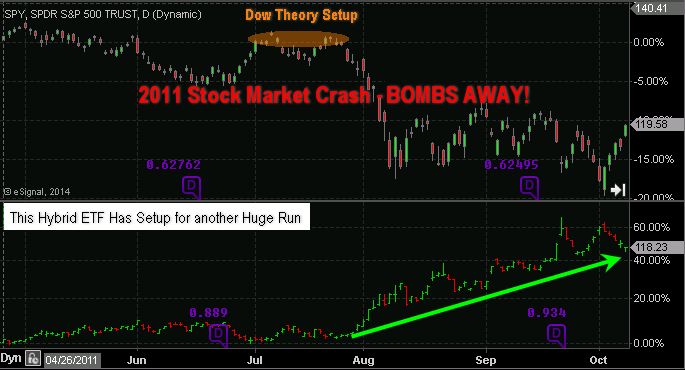
Let’s start with the SPY. From the visual analysis of the chart, below, it would be difficult for anyone to clearly see the fragility of the US or Global markets. This chart is showing a clearly bullish trend with the perception that continued higher highs should prevail.


Additionally, when we review the QQQ we see a similar picture. Although the volatility is typically greater in the NASDAQ vs. the S&P, the QQQ chart presents a similar picture. Strong upward price activity in addition to historically consistent price advances. What could go wrong with these pictures – right? The markets are stronger than ever and as we’ve all heard “it’s different this time”.


Most readers are probably saying “yea, we’ve heard it before and we know – buy the dips”.

Recently, we shared some research with you regarding longer term time/price cycles (3/7/10 year cycles) and prior to that, we’ve been warning of a Sept 28~29, 2017 VIX Spike that could be massive and a “game changer” in terms of trend. We’ve been warning our members that this setup in price is leading us to be very cautious regarding new trading signals as volatility should continue to wane prior to this VIX Spike and market trends may be muted and short lived. We’ve still made a few calls for our clients, but we’ve tried to be very cautious in terms of timing and objectives.

Right now, the timing could not be any better to share this message with you and to “make it public” that we are making this prediction. A number of factors are lining up that may create a massive price correction in the near future and we want to help you protect your investments and learn to profit from this move and other future moves. So, as you read this article, it really does not matter if you believe our analysis or not – the proof will become evident (or not) within less than 60 days based on our research. One way or another, we will be proven correct or incorrect by the markets.

Over the past 6+ years, capital has circled the globe over and over attempting to find suitable ROI. It is our belief that this capital has rooted into investment vehicles that are capable of producing relatively secure and consistent returns based on the global economy continuing without any type of adverse event. In other words, global capital is rather stable right now in terms of sourcing ROI and capital deployment throughout the globe. It would take a relatively massive event to disrupt this capital process at the moment.

Asia/China are pushing the upper bounds of a rather wide trading channel and price action is setting up like the SPY and QQQ charts, above. A clear upper boundary is evident as well as our custom vibrational/frequency analysis arcs that are warning us of a potential change in price trend. You can see from the Red Arrow we’ve drawn, any attempt to retest the channel lows would equate to an 8% decrease in current prices.


Still, there is more evidence that we are setting up for a potentially massive global price move. The metals markets are the “fear/greed” gauge of the planet (or at least they have been for hundreds of years). When the metals spike higher, fear is entering the markets and investors avoid share price risks. When the metals trail lower, greed is entering the markets and investors chase share price value.

Without going into too much detail, this custom metals chart should tell you all you need to know. Our analysis is that we are nearing the completion of Wave C within an initial Wave 1 (bottom formation) from the lows in Dec 2016. Our prediction is that the completion of Wave #5 will end somewhere above the $56 level on this chart (> 20%+ from current levels). The completion of this Wave #5 will lead to the creation of a quick corrective wave, followed by a larger and more aggressive upward expansion wave that could quickly take out the $75~95 levels. Quite possibly before the end of Q1 2018.


We’ve termed this move the “Rip your face off Metals Rally”. You can see from this metals chart that we have identified multiple cycle and vibrational/frequency cycles that are lining up between now and the end of 2017. It is critical to understand the in order for this move to happen, a great deal of fear needs to reenter the global markets. What would cause that to happen??

Now for the “Hidden Gem”....

We’ve presented some interesting and, we believe, accurate market technical analysis. We’ve also been presenting previous research regarding our VIX Spikes and other analysis that has been accurate and timely. Currently, our next VIX Spike projection is Sept 28~29, 2017. We believe this VIX Spike could be much larger than the last spike highs and could lead to, or correlate with, a disruptive market event. We have ideas of what that event might be like, but we don’t know exactly what will happen at this time or if the event will even become evident in early October 2017. All we do know is the following....

The Head-n-Shoulders pattern we first predicted back in June/July of this year has nearly completed and we have only about 10~14 trading days before the Neck Line will be retested. This is the Hidden Gem. This is our custom US Index that we use to filter out the noise of price activity and to more clearly identify underlying technical and price pattern formations. You saw from the earlier charts that the Head n Shoulders pattern was not clearly visible on the SPY or QQQ charts – but on THIS chart, you can’t miss it.

It is a little tough to see on this small chart but, one can see the correlation of our cycle analysis, the key dates of September 28~29 aligning perfectly with vibration/frequency cycles originating from the start of the “head” formation. We have only about 10~14 trading days before the Neck Line will likely be retested and, should it fail, we could see a massive price move to the downside.


What you should expect over the next 10~14 trading days is simple to understand.

Expect continued price volatility and expanded rotation in the US majors.
  • Expect the VIX to stay below 10.00 for only a day or two longer before hinting at a bigger spike move (meaning moving above 10 or 11 as a primer)
  • Expect the metals markets to form a potential bottom pattern and begin to inch higher as fear reenters the markets _ Expect certain sectors to show signs of weakness prior to this move (possibly technology, healthcare, bio-tech, financials, lending)
  • Expect the US majors to appear to “dip” within a 2~4% range and expect the news cycles to continue the “buy the dip” mantra.
The real key to all of this is what happens AFTER October 1st and for the next 30~60 days after. This event will play out as a massive event or a non event. What we do know is that this event has been setting up for over 5 months and has played out almost exactly as we have predicted. Now, we are 10+ days away from a critical event horizon and we are alerting you well in advance that it is, possibly, going to be a bigger event.

Now, I urge all of you to visit our website to learn more about what we do and how we provide this type of advanced analysis and research for our clients. We also provide clear and timely trading signals to our clients to assist them in finding profitable trading opportunities based on our research. Our team of dedicated analysts and researchers do our best to bring you the best, most accurate and advanced research we can deliver. The fact that we called this Head-n-Shoulders formation back in June/July and called multiple VIX Spike events should be enough evidence to consider this call at least a strong possibility.

If you want to take full advantage of the markets to profit from these moves, then join us today here at the Active Trading Partners and become a member.


Stock & ETF Trading Signals


Sunday, September 13, 2015

Hate Mail, Crumbling Factories, and Sinking Stocks

By Tony Sagami 

The bulls are mad at me. I’ve been heavily beating the bear market drum in this column since the spring. The S&P 500, by the way, peaked on May 21, and this column has been generating a rising stream of hate mail from the bulls as the stock market has dropped. My hate mail falls into two general categories: (1) you are wrong, and/or (2) you are stupid.

Well, I may not be the sharpest tool in the Wall Street shed, but I haven’t been wrong about where the stock market was headed. This column, however, isn’t about me. It’s about protecting and growing your wealth—and that’s why I have been so forceful about the rising dangers the stock market is facing.

Make sure you watch this weeks new video...."500K, Profit and Proof"

One of the themes I’ve repeatedly covered in this column is the rapidly deteriorating health of the two most basic economic building blocks of the American economy: the “makers” (see August 25 column) and the “takers” (see July 14 and August 4 columns).

There are thousands of economic and business statistics you can look at to gauge the health of the US economy, but at the economic roots of any developed country is the prosperity of its factories (makers) and transportation companies (takers) delivering those goods to stores.

This week, let’s look at the latest evidence confirming the piss poor health of American factories.

Factory Fact #1: The Institute for Supply Management released its latest survey results, which showed a drop to 51.1 in August, a decline from 52.7 in July, below the 52.5 Wall Street forecast, and the weakest reading since April 2009.


NOTE: The ISM survey shows that raw-materials prices dropped for 10 months in a row. If you own commodity stocks—such as copper, oil, aluminum, or gold—you should consider how falling raw materials prices will affect the profits of those companies.

Factory Fact #2: Despite all the crowing from Washington DC about the improving economy, US manufacturing output is still worse today than it was before the 2008-2009 Financial Crisis, according to the Federal Reserve.


Factory Fact #3: Business inventories increased at the fastest back to back quarterly rate on record. Inventories increased 0.8% in Q2, following a 0.3% increase in Q1, and now sit at $586 billion. That’s a 5.4% year over year increase!


Remember, there are two reasons why businesses accumulate inventory:
  • Business owners are so optimistic about the future that they intentionally accumulate inventory to accommodate an upcoming avalanche of orders.
OR
  • Business is so bad that inventory is starting to involuntarily pile up from the lack of sales.
Factory Fact #4: The Manufacturers Alliance for Productivity and Innovation (MAPI), a trade association for US manufacturers, is none too optimistic about the state of American manufacturing.
The reason for the pessimism is simple: US manufacturers are struggling.

  • U.S. manufactured exports decreased by 2% to $298 billion in the second quarter, as compared with 2014.
  • The US deficit in manufacturing rose by $21 billion, or 15%, compared with the second quarter of 2014.
“The US $48 billion deficit increase in the first half of the year equates to a loss of 300,000 trade related American manufacturing jobs, and the deficit is on track for a loss of 500,000 or more jobs for the calendar year,” said Ernest Preeg of MAPI.

So what does all this mean?

When I connect those dots, it tells me that American manufacturers are struggling. Really struggling.
Take a look at the Dow Jones US Industrials Index, which peaked in February and started to drop well ahead of the August market meltdown.


You know what’s really nuts? The P/E ratio for this struggling sector is almost 19 times earnings and 3.3 times book value!


Is there a way to profit from this slowdown of American factories? You bet there is.

Take a look at the ProShares UltraShort Industrials ETF (SIJ). This ETF is designed to deliver two times the inverse (-2x) of the daily performance of the Dow Jones US Industrials Index. To be fair, I should disclose that my Rational Bear subscribers have owned this ETF since June 16, 2015, and are sitting on close to a 15% gain.

Critics could say that I am “talking up my book,” but I instead see it as “eating my own cooking.” My advice in this column isn’t theoretical—we put real money behind my convictions. That doesn’t mean you should rush out and buy this ETF tomorrow morning. As always, timing is everything, so I suggest you wait for my buy signal.

But make no mistake, American “makers” are doing very poorly, and that’s a reliable warning sign of bigger economic problems.
Tony Sagami
Tony Sagami

30 year market expert Tony Sagami leads the Yield Shark and Rational Bear advisories at Mauldin Economics. To learn more about Yield Shark and how it helps you maximize dividend income, click here.

To learn more about Rational Bear and how you can use it to benefit from falling stocks and sectors, click here.


Get our latest FREE eBook "Understanding Options"....Just Click Here!

Thursday, January 15, 2015

Last Week's Volatility Could Be A Harbinger Of Things To Come

There's a war going on right now and I don't mean overseas, I mean right here in the markets. Last week was a perfect example as the intraday swings of the S&P500 clocked in at a staggering 6.5%. Market volatility often is a precursor of things to come, and the irony of all this action was that the market closed with a loss of -0.65% for the week.

The net weekly change for the DOW was -0.53% and there was an even smaller loss of -0.42% for the NASDAQ. All three indices formed an important Japanese candlestick pattern, a weekly doji candle. Why is this important? A doji candlestick often signals indecision in the market. When the doji forms in an uptrend or downtrend, this is normally seen as significant, as it is a signal that the buyers are losing conviction when formed in an uptrend and a signal that sellers are losing conviction if seen in a downtrend.


What To Watch For This Week

A lower weekly close would indicate to me that the buyers are beginning lose control of this aging bull market. Here is the "line in the sand" for each of the indices that I am watching. Once below this line, watch for heavy liquidation to come in across the board.

DOW: 17.262 S&P500: 1,992 NASDAQ: 4.090

Gold Is Now Officially On The Move

You might remember on January 7th, I wrote a post on gold (FOREX:XAUUSDO) and the key neckline level. The key neckline in gold was broken to the upside last Friday when gold closed out the week with a very positive 2.9% gain. I now have a confirmed upside target zone of $1,340, which equates to about $132-$134 on the ETF, GLD. To follow all of the entry and exit points for gold, check in daily with the World Cup Portfolio.

How High Can The Dollar Go?

The U.S. Dollar Index (NYBOT:DX) continues to push higher against most currencies with another weekly gain of 0.85% in the Dollar Index. The question on everyone's mind is, how high can the dollar go without a correction? To this observer, it appears that there are technical storm clouds gathering that could spell trouble for the dollar. Take a look at the RSI indicator and check out the negative divergence that is building on the weekly charts. If you are long the dollar, you might want to review and tighten your stops.

How Low Can Crude Oil Go

That's a question better asked to Saudi Arabia as they continues to keep their oil spigots open to the world. Here is my analysis, the trend is down and picking bottoms or tops in markets is not a high percentage game. Before crude oil (NYMEX:CL.H15.E) changes trend, it needs to begin to base out and find a floor. I will leave picking bottoms to others. Meanwhile, the trend is your friend.

Have a Different View?

I invite your comments, pro or con. As always, we appreciate your feedback.

Just Click Here to get all of my Blog Post in your inBox

Every success with MarketClub,
Adam Hewison 
President, INO.comCo-Creator, MarketClub


Get our latest FREE eBook "Understanding Options"....Just Click Here!


Tuesday, January 13, 2015

EFPs and The Unanticipated Consequences of Purposive Social Action

By Jared Dillian


Pretend you are a corn trader. As such, you have two choices: have a position in corn futures or own physical corn. It may seem silly to even consider owning physical corn, because corn futures are easy to trade—just click a button on your screen. But assume you have a grain elevator, and whether you own futures or physical corn is all the same to you. How do you decide which you prefer?

If one is mispriced relative to the other.

If you consider owning physical corn, you have to take into account the cost of storage and any transportation costs you may incur getting the corn to the delivery point. You also have to think of the cost of carrying that physical corn position, or the opportunity loss you incur by not investing the money in the risk-free alternative.

The thing is, there’s nothing keeping the spot and futures markets on parallel tracks, aside from the basis traders who spend their time watching when the futures get out of whack from the physical. That basis exists in just about every futures market, even in financial futures that are cash settled. In fact, that was pretty much my life when I was doing index arbitrage—trading S&P 500 futures against the underlying stocks. I was basically a fancy version of the basis trader in corn.

With stock index futures (like the S&P 500, or the NDX, or the Dow), the basis is slightly more complicated. Not only do you have to calculate the cost of carry—which is usually determined by risk free interest rates and the stock loan market for the underlying securities—but you also have to take into account the dividends that the underlying stocks pay out. Remember, futures don’t pay dividends, but stocks do. At Lehman Brothers, we had a guy whose sole job was to construct and maintain a dividend prediction model for the S&P 500.

So far, so good. However, one of the first things I learned about on the index arbitrage desk was EFP, which stands for Exchange for Physical—a corner of the market almost nobody knows about.

Basically, we could take a futures position and exchange it for a stock position at an agreed-upon basis with another bank or broker. Interdealer brokers helped arrange these EFP trades. The reason so few people know about them is probably because, historically, the EFP market has been very sleepy. The most it would usually move in a day was 15 or 20 cents in the index, or in interest rate terms, a few basis points.

Now it is moving several dollars at a time.

A Basis Gone Berserk


Back when I was doing this about ten-plus years ago, we had a balance sheet of about $8 billion, which is to say that we carried a hedged position of stocks versus S&P 500 futures (also Russell 2000 futures, NASDAQ futures, etc.).

We did this for a few reasons. One, it was profitable to do so—the basis often traded rich so that by selling futures and buying stock and holding the position until expiration, we would make money. Also, by carrying this long stock inventory, we were able to offset short positions elsewhere in the firm and reduce the firm’s cost of funds. At Lehman and most other Wall Street firms, index arbitrage was a joint venture with equity finance.

During the tech bubble in 1999, the basis got very, very rich because money was plowing into mutual funds and managers were being forced to hold futures for a period of time until they were able to pick individual stocks.

During the bear market in 2008, the basis traded very cheap, up until very recently, because inflows into equity mutual funds were weak, and index arbitrage desks were willing to accept less profit on their balance sheet positions.

But now, the basis has gone nuts.

It always goes a little nuts toward year-end because banks try to take down positions to improve the optics of their accounting ratios. If you have fewer assets, your return on assets looks better. So when banks try to get rid of stock inventory into year-end, they buy futures and sell stock, pushing up the basis.

But now it has skyrocketed, and the cause seems to be the effects of regulation.

We’ve talked about this before, in reference to corporate bonds. Banks aren’t keeping a lot of inventory anymore, because there’s no money in it. The culprits here are a combination of Dodd-Frank and Basel III. There are all kinds of unintended consequences, and the EFP market going nuts is probably the least of it.

But even that is a big one. Basically, it has introduced significant costs (about 1.5% annually) to the holder of a long futures position, which includes everyone from indexers all the way down to retail investors. These are the sorts of things that don’t get talked about in congressional hearings. Did XYZ law work? Sure it worked. But now it costs you 1.5% a year to hold S&P 500 futures and roll them, and you can’t get a bid for more than $2 million in a liquid corporate bond issue.

It’s All About Liquidity


The liquidity issue is the biggest one, and the one I harp on all the time. Pre Dodd-Frank, the major investment banks were giant pools of liquidity. You wanted to do a block trade of 20 million shares? No problem. You wanted to trade $250 million of double-old tens? It could be done.

Not anymore. Liquidity has diminished in just about every asset class, from FX to equities to rates to corporates, because compliance costs have gone up and it’s expensive to hold more capital against these positions. Someday, someone might take up the slack, like second-tier brokers or even hedge funds.
But here’s the biggest consequence of the equity finance market blowing up: High-frequency trading (HFT) firms that aren’t self-clearing now find it difficult to trade profitably and stay in business. With fewer of them around, we will finally get an answer to the question whether they add to liquidity or not.

So if you talk to an index arbitrage trader about what is going on with the EFP market, he can tell you precisely why it is screwed up. It’s an open secret on Wall Street. Introduce a regulation over here, an unintended consequence pops up over there. Then there are more regulations to deal with the unintended consequences. Regulations have added 100 times the volatility to one of the most liquid and ordinary derivatives in the world—the plain vanilla EFP.

Less liquidity, more volatility—welcome to 2015.
Jared Dillian
Jared Dillian


Get our latest FREE eBook "Understanding Options"....Just Click Here!


Sunday, May 4, 2014

World Money Analyst: Europe....Cliff Ahead?

By Dirk Steinhoff
When Kevin Brekke, managing editor [of World Money Analyst], contacted me last week, I knew it was time again to survey the investment landscape. This month, I will focus on Europe and its decoupled financial and real economy markets.

Globally, the last two years were marked by booming stock exchanges of developed markets, disappointing bond markets, and devastation across the precious metals markets.

Since June 2012, the EURO STOXX 50 Index, Europe’s leading blue chip index for the Eurozone, has advanced by approximately 50% and outperformed even the S&P 500 and the MSCI World indices.


Over the last six months, European stock exchanges have seen a surprising change of leadership: The major stock market indices of the “weaker” countries, like Portugal, Spain, and Italy, have outperformed those considered stronger, like Germany. One of the top performers was a country that was and still remains in “bankruptcy” mode: Greece.


The question at this point is: Can these outstanding European stock market performances continue?

In our search for an answer, let’s start with a closer look at the economic conditions within the European Union (EU), where approximately 2/3 of total “exports” (internal and external) of the EU-28 are traded. And then let’s have a look at the economic setting of some major trading partners, such as the US and BRIC countries, which account for roughly 17% and 21%, respectively, of the external exports of the EU-28.
Although the EURO STOXX 50 Index has soared since June 2012, certain key measures of the underlying real economies paint a different picture.

To start, the GDP of the EU-28 is not really growing. In 2012, it contracted by 0.4% and grew by the smallest fraction of 0.1% in 2013. The GDP growth numbers for the countries in the euro area are even worse: -0.7% in 2012 and -0.4% in 2013. Whereas Germany’s GDP was up in 2013 by 0.5%, economic growth was down in Spain, Italy, and Greece by -1.2%, -1.8%, and -3.6%, respectively.

Real GDP Growth Rates 2002-2012
2002
2003
2004
2005
2006
2007
2008
2009
2010
2011
2012
EU
1.3
1.5
2.6
2.2
3.4
3.2
0.4
-4.5
2.0
1.6
-0.4
Germany
0.0
-0.4
1.2
0.7
3.7
3.3
1.1
-5.1
4.0
3.3
0.7
Spain
2.7
3.1
3.3
3.6
4.1
3.5
0.9
-3.8
-0.2
0.1
-1.6
France
0.9
0.9
2.5
1.8
2.5
2.3
-0.1
-3.1
1.7
2.0
0.0
Italy
0.5
0.0
1.7
0.9
2.2
1.7
-1.2
-5.5
1.7
0.5
-2.5
Portugal
0.8
-0.9
1.6
0.8
1.4
2.4
0.0
-2.9
1.9
-1.3
-3.2


The EU unemployment rate stood at 10.2% at the beginning of 2012 and stands at 12.1% today. That the European Union is anything but a homogenous body that moves in unison can be seen in the following chart:


Where Germany has a current unemployment rate of 5.2% and a youth (under 25) unemployment rate of 7.5%, the numbers for other countries are worrisome: Current unemployment in Spain is 26.7%, and 12.7% in Italy, with youth unemployment in Spain at an incredible 57.7%, and 41.6% in Italy. And don’t forget Greece, which is mired in a historically unparalleled economic depression where unemployment is 28% and youth unemployment is a shocking 61.4%. Keep in mind that all of these numbers are those officially released by bureaucratic agencies. The real numbers, as we know, would likely be even worse.

Recent EU industrial production numbers have shown some slight improvement. Nevertheless, industrial production has only managed to recover to its 2004 level, and remains way below its 2007 heights (see next graph).

Source: Eurostat

So let’s see: a shrinking GDP, high and rising unemployment, and stagnant production significantly below 2007 levels. Those are not the rosy ingredients of a booming economy (as indicated by the stock exchanges) but of one that is struggling.

Europe is not in growth mode.

This verdict is further supported by the export numbers for trade between EU countries, known as internal trade. In 2001, internal trade accounted for 67.9% of EU exports. Today, this share is down to 62.7%. In an attempt to compensate for sluggish European growth, EU companies had to develop other export markets, such as the US or the emerging markets.

Will these markets help rescue European companies?

Time to Taper Expectations

With regards to the U.S., two important developments are worth mentioning. The first key development, which will have severe consequences for the global economy, was brought to my attention by my friend Felix Zulauf, an internationally well-known investor and regular member of the Barron’s Roundtable for more than 20 years. Running ever-increasing deficits in its trade and current accounts for almost 30 years, the US thus provided an enormous amount of stimulus for foreign exporters. Since 2006, however, the US trade deficit has shrunk, with deteriorating trade data for many nations as a consequence.


The second key development is that the newly appointed head of the US Federal Reserve system, Janet Yellen, seems determined to continue the taper of its bond buying program. This fundamental shift in monetary policy could be questioned if the economic numbers for the US begin to show significant weakness. But in the meantime, the reduction of economic stimulus in the US should lead to a reduced appetite for European export goods.

The emerging markets had been seen, not too long ago, as the investment opportunity and alternative to the fiscal and debt crisis-stricken countries of the developed world. Today, on a nearly daily basis, you hear bad news about the situation and developments in the emerging countries: swaying stock markets, plunging currencies, company bankruptcies, corruption scandals, and even riots.

The emerging markets are dealing with the unintended consequences of the Quantitative Easing (including liquidity easing and credit easing) programs in the West. The increased liquidity spilled over into the emerging markets in the hunt for yield. This flow of capital into the emerging markets lowered capital costs, inflated asset prices like stocks and real estate, and boosted commodity prices. All that, and more, sparked the emerging markets boom.

Now, this process has reversed. The natural conclusion to exaggerated credit-driven growth, the tapering of QE programs, the shrinking US trade deficit, and lower commodity prices has been an outflow of capital from emerging markets, triggering lower asset prices and exchange rates. The attempt of some countries to defend their currencies by raising interest rates will only exert further pressure on their economies.

With weaker emerging market economies and currencies, there will be no big added demand for European exports. Revenues and profits for EU companies (measured in euros) will fall.

When Trends Collide

So, over the last two years we had opposing trends—booming European stock markets and weak underlying real economies. This conflicting mix was mainly fostered by easy money that drove down interest rates to historic low levels. Plowing money into stocks, despite the poor fundamentals, was the only solution for most investors.

At their current elevated levels European stock markets appear vulnerable, and it seems reasonable to doubt that we will see a continuation of booming stock markets. Of course, such a decoupling can continue for some time, but the longer it continues, the closer we will get to a correction of this anomaly. Either the real economy catches up to meet runaway stock prices, or stock prices come down to meet the poor economic reality. Or some combination of the two.

Because of the economic facts that I discussed above, in my view, we may be seeing just the beginning of a stronger correction in stock prices.

Dirk Steinhoff is chief investment officer of portfolio management (international clients) at the BFI Capital Group. Prior to joining BFI in 2007, Mr Steinhoff acted as an independent asset manager for over 15 years. He successfully founded and built two companies in the realm of infrastructure and real estate management. Mr Steinhoff holds a bachelor’s and master’s degree in civil engineering and business administration, magna cum laude, from the University of Technology in Berlin, Germany. 


Want to read more World Money Analyst articles like this? Subscribe to World Money Analyst today and learn how to look abroad for truly diverse opportunities that insulate you from domestic risk.
The article World Money Analyst: Europe: Cliff Ahead? was originally published at Mauldin Economics


Sign up for one of our Free Trading Webinars....Just Click Here!


Tuesday, April 1, 2014

SP500 ETF Trading Strategies & Plan of Attack for This Week

Index ETF Trading Strategies: Stocks have kick started this week with a 0.85% pop in price but the big question is if the market can hold up. Last week stocks repeatedly gap higher and sold off with strong volume telling us that institutions are slowing phasing out of stocks (distribution selling) unloading shares into strength and passing them onto the a average investor to be left holding bag.

I want to show you a couple charts which show the price action, volume and money flow of the SP500 so you have a visual of what I am talking about.

30 Minute Intraday SP500 Chart – ETF Trading Strategies

In the chart below you can see the price gaps followed by selling. Why is this important? It is important because during a down trend the market makers and big money plays who have the money and tools to manipulate the markets will allow the market drift higher or they will run price up in overnight or premarket trading when volume is light. Once the 9:30am ET opening bell rings volume and liquidity spike which allows the big money player to sell remaining long positions and or add to short positions they have.

If you look at the blue on balance volume line at the bottom of the chart you can clearly see that more contracts are being sold than bought which is typically an early warning sign that the market is about to fall farther.

ETF Trading Strategies
 

Automated Trading System – 30 Minute ES Futures Chart


Below is a marked up screen shot of my automated trading system which I use for timing both futures and ETF trading strategies. The color coded bars tell you the market trend along with the strength of buyers and sellers.

When you couple market cycles, trends, volume/money flow, along with chart patterns we can forecast and trade markets with a high degree of accuracy in terms of market direction and timing.

Automated Trading Systems
 
My Index ETF Trading Strategies Conclusion:
 
Just to be clear on the current market trend and my overall outlook let me explain a little more. Overall, the broad stock market remains in an uptrend. Thursday and Friday of last week we started getting orange bars on the chart telling us that cycles, volume, and momentum are now neutral. It’s 50/50 on which way the market will go from here, so until the market internals (cycles, volume, breadth) push the odds in our favor enough for a short sell trade or a new long entry we will not add new positions to our portfolio.

It is important to understand that nearly 75% of stocks/investments move with the broad market. So we don’t want to add more long positions when the odds are not in favor of higher prices. Trading in general is not hard to do, but creating, following, executing properly money and position management is. If you have trouble with following or creating an ETF trading strategy you can have my ETF trading system for rising, falling and sideways markets traded automatically in your trading account.

Learn more here about my Automated Trading Systems

See you in the market! 
Chris Vermeulen


Sign up for one of our Free Trading Webinars....Just Click Here!


Thursday, March 6, 2014

How Much Will a 15% Hair Cut Cost Your Investment Capital?

Over the past few weeks I have been watching the DOW and Transportation index closely because it looks and feels like the Dow Theory may play out this year and the stock market could take a 15% haircut.

But what if you skipped on the haircut and opted for a 40% refund?  What? Keep reading to find out how.

Keeping this post short and sweet, I think the U.S. stock market is setting up for a sharp selloff. And it will look a lot like the July 2011 correction. If my calculations are correct this will happen in the next 3-9 weeks and we will see a 15% drop from our current levels. Only time will tell, but I have a way to hedge against this with very little downside risk to you ETF portfolio.

The Dow Theory Live Example for ETF Portfolio

The daily chart of the SP500 index below shows our current trend analysis with green bars signaling an uptrend, orange being neutral, and red signaling bearish price action. Currently the bars are green and we can expect prices to have an upward bias.

The Dow Theory could be  in play. When both the Transports (IYT) and the Dow Jones Industrial Average (DIA) cannot make higher highs and start making lower lows, according to the Dow Theory the broad stock market is topping.

We are watching the market closely because they have both made lower highs and lows.  This rally could stall in the next couple weeks and if so we expect a 15% correction.


Model ETF Portfolio


Take a look at the 2011 Stock Market Crash

Model ETF Portfolio Trading

The chart above shows how fearful traders have a delayed reaction to moving money from stocks to a mix of risk-off assets.

The choppy market condition during August and September clearly helped in frustrating investors and created more uncertainty. This helped prices of this ETF portfolio fund rally long after the initial selloff took place. This is something I feel will take place again in the near future and subscribers of my ETF newsletter will benefit from this move.

Because we have a Dow Theory setup, our risk levels are clearly defined as to when to exit the trade if it does not play out in our favor. But with the potential to make 40% and the downside risk only being 4%, it’s the perfect setup for a large portion of our ETF portfolio. And just so you know this is not a precious metals trade as we are already long that sector and up 10% in that position already.

Get My Daily Video Forecasts & ETF Trades Today


Chris Vermeulen
The Gold & Oil Guy.com


Friday, December 27, 2013

Bear Market Cycle Bottom Forming in Gold and Gold Stocks Right Now!

Today our trading partner David Banister takes a look at the Bullish Percent Index chart relative to Gold’s cycle and Gold Stocks.

Essentially it tells you what percentage of Gold sector stocks are at or above a moving average, which normally would be 50 days. When 70% or more are above a 50 day moving average, sectors can be peaking out. If you look at our chart at the bottom, we have labeled various incidents with A, B, C, and D.

A. The precious metal as we all know peaked in the fall of 2011 at $1923 per ounce, and the Bullish percent index was at 80%! Usually at 30% or so, they are bottoming out in most cases.

B. We saw a rare case in the summer of 2013 where the Bullish percent index for Gold stocks was at 0%, yes that is not a miss-print.

C. Gold bottomed at 1181 in late June 2013, and then rallied up to 1434 and we saw Gold stocks rally 40-80% in individual cases and the Bullish percent index rallied up to 55%.

D. If we fast forward to December 2013, we have Gold pulling back in the final 5th wave down from the Bull cycle highs in August 2011 at $1923. The Bullish percent index is back to 10% and heading towards 0 or close once again. At the same time, the Gold miners index ETF (GDX) is at 5 year lows and even lower than June-July 2013 lows.

These types of indicators are coming to a pivot point where Gold is testing the summer 1181 lows and may go a bit lower to the 1090 ranges. At the same time, we see bottoming 5th wave patterns combining with public sentiment, bullish percent indexes, and 5 year lows in Gold stocks. This is how bottom in Bear cycles form and you are witnessing the makings of a huge bottom between now and early February 2014 if we are right.

The time to buy Gold and Gold stocks is now during the next 4 - 5 weeks just as we were recommending stocks in late February 2009 with public articles that nobody paid attention to. This is the time to start accumulating quality gold miner and also the precious metals themselves as the bear cycle winds down and the spring comes back to Gold and Silver in 2014.


Click here to join us at Market Trend Forecast for regular updates on Gold, Silver, and The SP 500 Index.


Monday, December 9, 2013

Christmas Rally Starts Monday....My ETF Trading Strategies

Our trading partner Chris Vermeulan says "Tis the Season for the most powerful seasonality trade of the year". Do you agree?


Seasonal ETF Trading Strategies With the stock market up big in 2013 and most participants are speculating on a pullback in the next week or two, Chris says he is on the other side of that bet. Being a technical trader he focuses on patterns, statistics and probabilities to power his ETF trading strategies. So with 37 years of stats the seasonality chart of the S&P 500 index paints a clear picture of what is likely to happen in December.

If you do not know how to read a seasonality chart, Chris will explain it as its very simple. Simply put, it shows what the index has done on average through each month over the past 37 years. December typically has the strongest up trend and probability of happening any other time of the year.

The Big Board – NYSE
 
The NYSE also referred to as the Big Board, is an index with the largest brand name companies. Most individuals do not follow this, but to Chris its as close to the holy grail of trading than anything else he uses. he uses many different data points from this index (momentum, order flow, trend) for his ETF trading strategies.

Let's take a look at what Chris says the seasonality chart his telling us as we close our 2013 and move into 2014......Click here to check out "Christmas Rally Starts Monday....My ETF Trading Strategies"


Get our "Gold and Crude Oil Trade Ideas"


Thursday, October 10, 2013

Who Knows More: The S&P 500 Options or Financial Pundits?

By now the major media outlets have made sure to inform the public that the U.S. government is shut down, or partially shut down depending on your political perspective. Most financial pundits are looking to the recent past for clues about what to expect in the future.

While the situation appears to be similar to what we witnessed in 2011 with the debt ceiling debacle, the outcomes may be significantly different. I am a contrarian trader by nature, and as such I am constantly expecting for markets to react in the opposite way from what the majority of investors expect.

A significant number of financial pundits and writers all have a similar perspective about what is likely to occur. It seems most of the financial punditry believe that until there is a resolution in the ongoing government debacle, market participants should expect volatility to persist. Some of the talking heads are even calling for a sharp selloff if no decision on the debt ceiling is made by early next week.

The debt ceiling decision needs to be made by midnight on October 17th otherwise the first ever default on U.S. government debt could occur. Thus far, the volatility index (VIX) has moved higher as investors and money managers use the leverage in VIX options to hedge their long exposure.

As can be seen here, we are seeing the VIX trade at the second highest levels so far in 2013.....Read the entire article "Who Knows More: The S&P 500 Options or Financial Pundits?"


Using options like a Professional Trader, get started now!


Monday, September 2, 2013

Is 1,600 the Next SP500 Support Level?

Chart1 (1)
Investors and traders alike are heading into the long weekend with a variety of potential risks facing them. The media has made us aware of the situation that is going on in Syria and that the United States may be planning a military strike.

Since the current Syrian situation arose, we have seen some strong volatility return to U.S. financial markets. The observed volatility has included both realized volatility and implied volatility in many of the various option chains. There are pundits who will surmise a variety of outcomes, but frankly no one knows for sure. Will oil prices spike if military action occurs in Syria? Will oil prices fall on a military action(s)? What will happen to gold? What will happen to risk assets? Will they find Jimmy Hoffa?

We have recently received several emails asking these questions. We have answered them all in the same manner. We have no idea what is going to happen in financial markets for sure. Anyone who says they do does not respect the randomness of markets. We can look at option based probabilities for some clues, but there is no definitive answer.

Instead we want to look at a very powerful tool that is available on most trading software platforms. Volume by price is a powerful tool to determine where key levels are in an index or price chart.

Our complete chart work and set ups for the S&P 500 Index are shown here.


Trade Stock and ETF's Options Like a Pro - Join Now!


Wednesday, May 22, 2013

Gold Stocks: Its Time To Be BRAVE!

By David Banister, Chief Strategist the Market Trend Forecast.........

I used to half joke with some of my investing friends that the best time to buy stocks is during or right after a crash. Think 1987, 2000-2002, 2008-09, and now perhaps Gold Miners?? Well, before we get too far ahead of ourselves, lets examine evidence of a “Crash”: I like to use crowd behavioral, empirical, and technical evidence in combination.

1. In a recent money managers poll, virtually nobody was bullish on Gold or Gold stocks, and over 80% of those polled were bullish on the SP 500 and US stocks.

2. The percentage of Dumb Money traders (non-reportable traders) in the futures markets with short positions on Gold is at all time highs, they tend to be very long at the highs and very short at the lows.

3. The insider buying ratio of Gold Mining stocks to sellers is running over 10 to 1, the highest since October 2008 when Gold bottomed out at $685 per ounce from $1030 highs. Quoting Ted Dixon, CEO of Ink Research, “such a high level of buying interest among officers and directors within their own businesses in the resource sector has correctly foreshadowed a recovery in share prices in the past: That high point of nearly five years ago came about six weeks before the Venture market bottomed on Dec. 5, 2008…While the excitement that surrounded mining stocks as recently as two years ago has waned, experienced value investors recognize that such periods of investor neglect often give rise to the best deals” Source: Theglobeandmail.com

4. The ratio of the HUI Gold Bugs Index to the SP 500 is at multi year lows and in near crash mode on the charts. The RSI Index (Relative strength) on the weekly charts is at 10 year lows at -13.71, which is off the charts low!!

5. Most trading message boards I view at Stocktwits and others are universally bearish on Gold and Gold stocks.

6. Gold is in a wave B or Wave 5 down re-testing the 1322 lows which we have discussed here for weeks as very likely if 1470 was not taken out on the upside… this is a normal sentiment pattern and re-test.

7. Gold has been in a 21 Fibonacci month correction pattern off a 34 Fibonacci month rally from 686-1923. In August of 2011 I penned articles from 1805 right up to 1900 warning of a massive wave 3 top forming. Everyone was bullish, now it’s the complete opposite.

8. Currency debasement continues around the world with negative real interest rates. This is bullish for Gold once this correction has run its course.

9. Hulbert Digest Gold Sentiment index is at an all time low (gold newsletters at -35 sentiment readings!!)

10. Gold -Silver put to call ratios are at all time highs

I could go on and on with headlines and such, but you get the idea. This is the same type of sentiment I wrote about on the stock market on Feb 25th 2009, here is that article... and nobody on the planet was bullish.

Below is a chart showing the Bullish % index for Gold Miners, as you can see the last time we were at 0% was late 2008 when Gold had bottomed out and insiders were also buying like crazy like now:

bll

The GLD ETF chart also shows a likely re-test or slightly lower of the 1322 futures lows of April, when Insider buying hit 10 year record levels:

gld

Obviously Gold could end up going a lot lower than we think, and the Gold Mining stocks could sink further yet. But for those with a 3-6 month horizon, we expect the 21-24 month Gold correction to complete by no later than October 2013. During the next several months the opportunities to buy some miners on the cheap will potentially make some investors a lot of money in the coming few years.


Join us here at Market Trend Forecast.com for occasional free reports or sign up for our daily updates on the SP 500 and Precious Metals


Make sure to grab our Bible for Commodity Traders....Get our free eBook now!

Sunday, April 29, 2012

Dollar Producing a Series of Higher Highs and Higher Lows, Cycle May Break Pattern

Recently I have been advising members of my service to be cautious as the market appears to be at a major crossroads. The U.S. Dollar Index is on the verge of a major breakdown. If a breakdown occurs it will be clear that the Federal Reserve will have officially stopped any potential rise in the U.S. Dollar. 
Over the past few months the Dollar has been producing a series of higher highs and higher lows, however the current cycle may break the pattern.....as can be seen here.

Tuesday, February 14, 2012

Two Short Term Scenarios for the S&P 500 Index

For the first time since the last week of December of 2011, the S&P 500 Index closed lower on the weekly chart. Recently I have been discussing the overbought nature of stocks based on a variety of indicators. However, the real question that should be asked is whether last week was just a short term event or if we see sustained selling in coming weeks.

The issues occurring in Greece spooked the markets somewhat on Friday as Eurozone fears continue to permeate in the mindset of traders. The U.S. Dollar Index is the real driver regarding risk in the near and intermediate term future. If the Dollar is strong, market participants will likely reduce risk. However a weakening Dollar will be a risk-on type of trading event which could lead to an extended rally in equities, precious metals, and oil.

Friday marked an important day for the U.S. Dollar Index futures as for the first time in several weeks the Dollar held higher prices into a daily close. The U.S. Dollar appears to have carved out a daily swing low on the daily chart from Friday. Furthermore, the potential for a weekly swing low at the end of this week remains quite possible. The chart below illustrates how the 100 period simple moving average has offered short term support for the past few weeks.

U.S. Dollar Index Futures Daily Chart


I would also point out that the MACD is starting to converge which is a bullish signal and the full stochastics are also demonstrating a cross on the daily time frame. As long as the 100 period moving average holds price, a rally is likely in the U.S. Dollar Index in coming weeks.

Should that rally play out, it will likely push risk assets lower. My primary target for the S&P 500 would be around the 1,300 – 1,310 price range if the selloff transpires. It is important to note that  headlines coming out of Europe could derail this analysis in short order.

Assuming that a selloff in the S&P 500 occurs it will present a difficult trading environment for market participants. Market participants are going to be in a tough position around the 1,300 price level. A rally from 1,300 could  serve to test the 2011 highs. In contrast, a confirmed breakdown of the 1,300 price level could initiate a more significant selloff towards the 1,250 area.

Should price move towards the 1,300 price level the bulls and bears will be battling it out for intermediate control of price action. This is my preferred scenario for the short term time frame, but I would only give it about a 60% chance of success at this point in time. We simply need more time to see how price action behaves the first few session of the forthcoming week.

S&P 500 Index Bearish Scenario


The alternate scenario which has about a 40% chance of success would be a sharp rally higher which likely would be produced by news coming out of Greece and/or the Eurozone that pushes the Euro higher. Right now risk is high due to the sensitivity of price to headline risk. With that said, the bullish alternative scenario is shown below.

S&P 500 Index Bullish Scenario

At this point we just do not have enough price information to give us clarity regarding the most probable outcome. The price action in the Euro is going to drive price action for the S&P 500 and other risk assets in weeks ahead.

Anything is possible in the short term, but I have to give a slight edge to the bears simply based on the price action Friday and the fact that almost every indicator I follow is screaming that the equities market is severely overbought. The price action this week should be telling. Headline risk is excruciatingly high, trade safely in the coming week!


Monday, May 2, 2011

The Man Who Built Pricing Models for Mutual Funds at Fidelity Investments.

For the past decade, a Russian-born former systems engineer at Fidelity Investments has been developing mechanical trading systems to trade the stock, commodities and Forex markets. He’s been developing and testing them with real money. 
 
His name is Mikhail Borisov. He’s had great success with a number of systems. In fact, about 80% of his systems produce consistent profits. 

Yet, NOTHING, and I mean nothing has generated the consistent, real world results like the system he’s developed for index options.  

Last year, in 2010, Mikhail used his new options trading system to make 93 trades, about 2 per week, every single one of which was for a gain!  

That is: Every one, without exception.
Just to clear this up from the get go: This is NOT another “hypothetical,” back tested system like we’ve all seen for the past 30 years.

This is REAL MONEY trading that has worked like a virtual ATM machine for the past 4 years running.  

In 2009, using this same system, Mikhail made 150 options trades an average of 3 per week. 
 
Out of the 150 trades, 147 were winners and just 3 were losers. That’s an accuracy rate of 98%.

Again, these were real money trades, not hypothetical profits like you see in back-tested trading software.  

Now, Mikahil and his team have created a series of videos that…
... reveal precisely how this trading system works... 
... why it produces more winners than any system Mikhail has ever seen, and 
... how the average investor can use it to produce consistent income week after week, month after month, no matter what is happening in the overall economy.

Best of all, these videos are absolutely FREE!

Some of Mikhail’s systems produced greater profits, but also greater losses. That wasn’t for him. He wanted an investing system that makes above average returns and lets him sleep at night.  

This new system does just that. 
 
In 4 YEARS of real money testing, this system has produced just 4 losers of between $548 and $650 each. As I said, for 2 out of the 4 years, it has produced NO LOSERS AT ALL, just 100% profitable trades.

It’s easy to sleep at night when your investments only go UP, and each week you have more money in your account than last week.

Don’t miss this rare, perhaps never to be repeated opportunity to see for yourself how I beat the market week after week. Simply:

Happy Trading,
Ray's Stock World


Share