On September 6th John Carter of Simpler Options treated us to a special online training webinar. We discovered low risk option strategies for catching "bold and beautiful" reversal trades. John also showed us how to hunt for tops and bottoms using low risk setups for trading precise turning points in any market and so much more.
Watch the FREE Replay Here
Most traders have no idea how to capture the massive profit potential from trading major reversals. These days’ markets often turn on a dime and those who wait for ‘conservative’ setups either miss out or suffer steep losses.
Here's what you can expect to learn during this webinar session....
* A simple 3-step process to identify major market turning points in any market
* How to find low risk, high probability trades in today's volatile market conditions
* Why it’s finally possible to catch tops and bottoms in real time on almost any chart
* Why these ‘Bold and Beautiful’ reversal trades can be safer than ‘comfortable’ trades
* How to avoid getting suckered into the costly traps that most traders fall into
* How to adapt your trades automatically for choppy conditions AND big trends
* How to know when a support or resistance level is likely to hold or not
Watch the FREE replay Right Here
See you in the markets,
Ray's Stock World
Get John's latest FREE eBook "Understanding Options"....Just Click Here!
Showing posts with label resistance. Show all posts
Friday, September 9, 2016
Tuesday, April 22, 2014
New Video: This Weeks Nasdaq Shorting Opportunity
It looks as though the Nasdaq is about ready for another leg lower. Chris Vermeulen shows us what key resistance levels to look at for a possible short trade on the Nasdaq this week.
Get These Trade Alerts Every Week with Chris Vermeulen's ETF Trading Newsletter
Sign up for one of our Free Trading Webinars....Just Click Here!
Get These Trade Alerts Every Week with Chris Vermeulen's ETF Trading Newsletter
Sign up for one of our Free Trading Webinars....Just Click Here!
Labels:
Chris Vermeulen,
NASDAQ,
resistance,
trade,
Video
Wednesday, January 8, 2014
This Thursday, John Carters "Voodoo Lines" Webinar
Free webinar on Thursday, January 9th at 8:00 p.m. eastern time. John Carter of Simpler Options is back with another one of his wildly popular free trading webinars.
In this Free Webinar you will learn:
* How to Identify Key Support and Resistance Levels
* What are Voo Doo Lines?
* Why Should You Care about Voo Doo Lines?
* What are the Voo Doo Lines Telling us now?
* John's Favorite Trading Strategies Using the Voo Doo and much more
Simply click here and we'll register you for this event
See you on the webinar!
In this Free Webinar you will learn:
* How to Identify Key Support and Resistance Levels
* What are Voo Doo Lines?
* Why Should You Care about Voo Doo Lines?
* What are the Voo Doo Lines Telling us now?
* John's Favorite Trading Strategies Using the Voo Doo and much more
Simply click here and we'll register you for this event
See you on the webinar!
Labels:
John Carter,
options,
resistance,
Simpler Options,
strategies,
support,
Trading,
Voo Doo,
webinars
Tuesday, July 16, 2013
Free Webinar: An evening with Carolyn "The Fibonacci Queen" Boroden Wednesday, July 17th at 8:00PM est
Time is running out to get your seat for Wednesdays webinar with Carolyn "The Fibonacci Queen" Boroden and John Carter of Simpler Options. So sign up now!
For years Carolyn Boroden has been using and teaching fund managers Fibonacci based market geometry and symmetry that provides the edge needed to succeed in choosing your entry and exits points for your biggest trades. And you can easily use these methods whether you are trading stocks, currencies, ETFs or commodities.
In this Free webinar Carolyn and John will show us......
* How to identify Fibonacci support & resistance zones
* The simple way to manage your risk/reward using Fibonacci ratios
* The brain dead easy ways to set up your support & resistance zones
* How you can identify what markets to trade and when
* The secret to identifying high probability targets in stocks and ETFs .... and much more
Simply click here and fill out your email address, click submit and you will be automatically registered for the webinar.
Get your seat now for "How to Use Fibonacci Analysis in Your Trading"
See you on Wednesday,
Ray's Stock World
For years Carolyn Boroden has been using and teaching fund managers Fibonacci based market geometry and symmetry that provides the edge needed to succeed in choosing your entry and exits points for your biggest trades. And you can easily use these methods whether you are trading stocks, currencies, ETFs or commodities.
In this Free webinar Carolyn and John will show us......
* How to identify Fibonacci support & resistance zones
* The simple way to manage your risk/reward using Fibonacci ratios
* The brain dead easy ways to set up your support & resistance zones
* How you can identify what markets to trade and when
* The secret to identifying high probability targets in stocks and ETFs .... and much more
Simply click here and fill out your email address, click submit and you will be automatically registered for the webinar.
Get your seat now for "How to Use Fibonacci Analysis in Your Trading"
See you on Wednesday,
Ray's Stock World
Sunday, July 14, 2013
Free Webinar: How to Use Fibonacci Analysis in Your Trading Wednesday, July 17th at 8:00PM est
For years Carolyn Boroden has been using Fibonacci based market geometry and symmetry that provides the edge needed to succeed in choosing your entry and exits points for your biggest trades. And you can easily use these methods whether you are trading stocks, currencies, ETFs or commodities.
In this Free webinar Carolyn "The Fibonacci Queen" Boroden and "Simpler Options" John Carter will show us......
* How to identify Fibonacci support & resistance zones
* The simple way to manage your risk/reward using Fibonacci ratios
* The brain dead easy ways to set up your support & resistance zones
* How you can identify what markets to trade and when
* The secret to identifying high probability targets in stocks and ETFs .... and much more
Simply click here and fill out your email address, click submit and you will be automatically registered for the webinar.
Watch "How to Use Fibonacci Analysis in Your Trading"
See you on Wednesday,
Ray @ Ray's Stock World
In this Free webinar Carolyn "The Fibonacci Queen" Boroden and "Simpler Options" John Carter will show us......
* How to identify Fibonacci support & resistance zones
* The simple way to manage your risk/reward using Fibonacci ratios
* The brain dead easy ways to set up your support & resistance zones
* How you can identify what markets to trade and when
* The secret to identifying high probability targets in stocks and ETFs .... and much more
Simply click here and fill out your email address, click submit and you will be automatically registered for the webinar.
Watch "How to Use Fibonacci Analysis in Your Trading"
See you on Wednesday,
Ray @ Ray's Stock World
Labels:
Carolyn Boroden,
commodities,
etf's,
fibonacci,
John Carter,
options,
probability,
queen,
resistance,
Stocks,
support,
Trades
Tuesday, May 14, 2013
How to Spot & Time Stock Market Tops
Since the middle of April everyone and including their grandmother seems to have been building a short position in the equities market and we know picking tops or bottoms fighting the major underlying trend is risky business but most individuals cannot resist.
The rush one gets trying to pick a major top or bottom is flat out exciting and that is what makes it so darn addicting and irresistible. If you have ever nailed a market top or bottom then you know just how much money can be made. That one big win naturally draws you back to keep doing it much like how a casino works. The chemicals released in the brain during these extremely exciting times are strong enough that even the most focused traders fall victim to breaking rules and trying these type of bets/trades.
So if are going to try to pick a top you better be sure the charts and odds are leaning in your favor as much as possible before starting to build a position.
Below are a few charts with my analysis and thoughts overlaid showing you some of the things I look at when thinking about a counter trend trade like picking a top within a bull market.
Utility Stocks vs SP500 Index Daily Performance Chart:
The SPY and XLU performance chart below clearly shows how the majority of traders move out of the slow moving defensive stocks (utilities – XLU) and starts to put their money into more risky stocks. This helps boost the broad market. I see the same thing in bonds and gold this month which is a sign that a market top is nearing.
That being said when a market tops it is generally a process which takes time. Most traders think tops area one day event but most of the times it takes weeks to unfold as the upward momentum slows and the big smart money players slowly hand off their long positions to the greedy emotion drove traders.
Look at the chart below and notice the first red box during September and October. As you can see it took nearly 6 weeks for that top to form before actually falling off. That same thing could easily happen again this time, though I do feel it will be more violent this time around.
SPY ETF Trading Chart Shows Instability and Resistance:
Using simple trend line analysis we see the equities market is trading at resistance and sideways or lower prices are more likely in the next week or two.
Stocks Trading Above 150 Day Moving Average Chart:
This chart because it’s based on a very long term moving average (150sma) is a slow mover and does not work well for timing traded. But with that said it does clearly warn you when stocks are getting a little overpriced and sellers could start at any time.
General rule is not to invest money on the long side when this chart is above the 75% level. Rather wait for a pullback below it.
Stocks Trading Above 20 Day Moving Average Chart:
This chart is based on the 20 day moving average which moves quickly. Because it reacts quicker to recent price action it can be a great help in timing an entry point for a market top or bottom. It does not pin point the day/top it does give you a one or two week window of when price should start to correct.
How to Spot and Time Stock Market Tops Conclusion:
As we all know or will soon find out, trading is one of the toughest businesses or and one of the most expensive hobbies that one will try to master. Hence the 95-99% failure rate of individuals who try to understand how the market functions, position management, how to control their own emotions and to create/follow a winning strategy.
With over 8000 public traded stocks, exchange traded funds, options, bonds, commodities, futures, forex, currencies etc… to pick from its easy to get overwhelmed and just start doing more or less random trades without a proven, documented rule based strategy. This type of trading results in frustration, loss of money and the eventual closure of a trading account. During this process most individuals will also lose friends, family and in many cased self-confidence.
So the next time you think about betting against the trend to pick a top or a bottom you better make darn sure you have waited well beyond the first day you feel like the market is topping out. Stocks trading over the 150 and 20 day moving averages should be in the upper reversal zones and money should be flowing out of bonds and other safe haven/defensive stocks to fuel the last rally/surge higher in the broad market.
Also I would like to note that I do follow the index futures and volume very closely on both the intraday and daily charts. This is where the big money does a lot of trading. Knowing when futures contracts are being sold or bought with heavy volume is very important data in helping time tops and bottoms more accurately. And the more experience you have in trading also plays a large part in your success in trading tops and bottoms.
Download our FREE eBook on Controlling Your Trades, Money & Emotions
And join our FREE Newsletter Today!
The rush one gets trying to pick a major top or bottom is flat out exciting and that is what makes it so darn addicting and irresistible. If you have ever nailed a market top or bottom then you know just how much money can be made. That one big win naturally draws you back to keep doing it much like how a casino works. The chemicals released in the brain during these extremely exciting times are strong enough that even the most focused traders fall victim to breaking rules and trying these type of bets/trades.
So if are going to try to pick a top you better be sure the charts and odds are leaning in your favor as much as possible before starting to build a position.
Below are a few charts with my analysis and thoughts overlaid showing you some of the things I look at when thinking about a counter trend trade like picking a top within a bull market.
Utility Stocks vs SP500 Index Daily Performance Chart:
The SPY and XLU performance chart below clearly shows how the majority of traders move out of the slow moving defensive stocks (utilities – XLU) and starts to put their money into more risky stocks. This helps boost the broad market. I see the same thing in bonds and gold this month which is a sign that a market top is nearing.
That being said when a market tops it is generally a process which takes time. Most traders think tops area one day event but most of the times it takes weeks to unfold as the upward momentum slows and the big smart money players slowly hand off their long positions to the greedy emotion drove traders.
Look at the chart below and notice the first red box during September and October. As you can see it took nearly 6 weeks for that top to form before actually falling off. That same thing could easily happen again this time, though I do feel it will be more violent this time around.
SPY ETF Trading Chart Shows Instability and Resistance:
Using simple trend line analysis we see the equities market is trading at resistance and sideways or lower prices are more likely in the next week or two.
Stocks Trading Above 150 Day Moving Average Chart:
This chart because it’s based on a very long term moving average (150sma) is a slow mover and does not work well for timing traded. But with that said it does clearly warn you when stocks are getting a little overpriced and sellers could start at any time.
General rule is not to invest money on the long side when this chart is above the 75% level. Rather wait for a pullback below it.
Stocks Trading Above 20 Day Moving Average Chart:
This chart is based on the 20 day moving average which moves quickly. Because it reacts quicker to recent price action it can be a great help in timing an entry point for a market top or bottom. It does not pin point the day/top it does give you a one or two week window of when price should start to correct.
How to Spot and Time Stock Market Tops Conclusion:
As we all know or will soon find out, trading is one of the toughest businesses or and one of the most expensive hobbies that one will try to master. Hence the 95-99% failure rate of individuals who try to understand how the market functions, position management, how to control their own emotions and to create/follow a winning strategy.
With over 8000 public traded stocks, exchange traded funds, options, bonds, commodities, futures, forex, currencies etc… to pick from its easy to get overwhelmed and just start doing more or less random trades without a proven, documented rule based strategy. This type of trading results in frustration, loss of money and the eventual closure of a trading account. During this process most individuals will also lose friends, family and in many cased self-confidence.
So the next time you think about betting against the trend to pick a top or a bottom you better make darn sure you have waited well beyond the first day you feel like the market is topping out. Stocks trading over the 150 and 20 day moving averages should be in the upper reversal zones and money should be flowing out of bonds and other safe haven/defensive stocks to fuel the last rally/surge higher in the broad market.
Also I would like to note that I do follow the index futures and volume very closely on both the intraday and daily charts. This is where the big money does a lot of trading. Knowing when futures contracts are being sold or bought with heavy volume is very important data in helping time tops and bottoms more accurately. And the more experience you have in trading also plays a large part in your success in trading tops and bottoms.
Download our FREE eBook on Controlling Your Trades, Money & Emotions
And join our FREE Newsletter Today!
Labels:
channel,
charts,
market,
moving average,
resistance,
short,
SP500,
spx trading,
spy trading,
traders,
Trades,
utilities,
utility,
XLU
Monday, July 30, 2012
The Federal Reserve, Gold, Crude Oil and the Dollar’s Demise
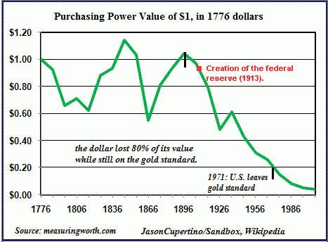
The Federal Reserve through its various monetary mechanisms has a major impact on the value of the U.S. Dollar and over time has destroyed the purchasing power of the fiat base currency used in the United States.
Interestingly enough, the following quote comes directly from the Federal Reserve’s website regarding one of its primary mandates, “In setting monetary policy, the Committee seeks to mitigate deviations of inflation from its longer-run goal and deviations of employment from the Committee’s assessment of its maximum level.”
The chart below illustrates the horrific job the Federal Reserve has done of protecting the purchasing power of the U.S. Dollar since its creation.
In light of the longer-term malaise seen above, the Dollar Index futures have recently rallied sharply higher as Europe continues to flail in a slow and agonizing decline which will ultimately lead to a complete fiscal disaster.
Sovereign debt concerns continue to mount regardless of what the European technocrats spew publicly and the U.S. Dollar has been the primary beneficiary of these seemingly growing concerns.
This brings me to the purpose of this article. Most of the articles I write are focused on option based trades, but I decided it was time to put forth a more comprehensive scenario that could unfold over the next few years as a result of excessive monetary stimulus through various quantitative easing mechanisms developed by the Federal Reserve Bank. “A mild change” to say the least . . .
As discussed above, the U.S. Dollar Index futures have moved higher throughout most of 2012. Any significant increase in the U.S. Dollar is a growing concern among central bankers as it correlates toward deflation. Deflation is the Fed’s biggest enemy, besides themselves of course.
Next week the Federal Reserve will release statements relating to the economic condition of the United States. Furthermore, the Fed also will discuss if it will initiate another dose of monetary crack for a capital market place that is addicted to cheap money and zero interest rates. At this point, the so-called marketplace is the antithesis of free by all standard measures.
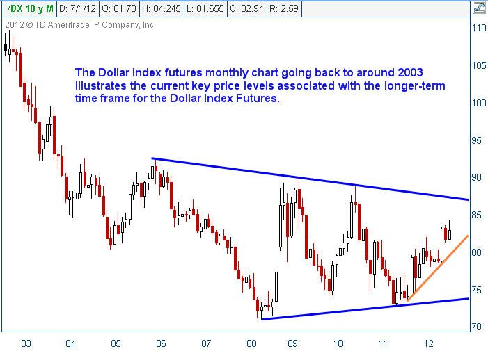
Consider the long-term monthly chart of the U.S. Dollar Index futures illustrated below:
The U.S. Dollar Index futures are in an uptrend that dates back to mid 2011. The orange line illustrates the uptrend and represents a key price level for the U.S. Dollar Index. For those unfamiliar with basic technical analysis, the rising orange trendline will act as buying support until the Dollar eventually breaks down through it signaling the bullish move higher has ended.
This brings us to a rather interesting potential observation. Today Mario Draghi, Chairman of the European Central Bank (ECB), made public comments regarding the readiness of the ECB to act if need be to safeguard the European Union. The Dollar Index Futures plummeted on the statement and remained under selling pressure most of the trading session on Thursday.
If a mere comment from the ECB can have such a damaging impact on the valuation of the Dollar, what would happen to the Dollar if the Fed initiated a new easing mechanism?
The answer is simple, the U.S. Dollar would immediately be under selling pressure. Selling pressure in the U.S. Dollar Index generally leads to a rally in risk assets such as equities and oil futures. Over the longer-term, a weak Dollar is also positive for precious metals and other hard assets.
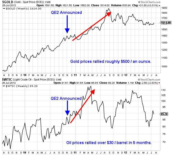
As an example to illustrate the power of Quantitative Easing as it relates to the price of both gold and oil, consider the following chart:
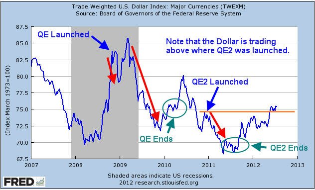
Obviously the price action is pretty clear that Quantitative Easing has a positively correlated impact on the price performance of hard assets, specifically gold and oil. Now consider a price chart of the Dollar Index shown below courtesy of the Federal Reserve Bank, the annotations are mine.
The chart above tells an interesting story about the impact that Quantitative Easing has on the Dollar. How can the Federal Reserve claim to be protecting the purchasing power of the U.S. Dollar when its actions have a direct negative correlation to the greenback’s price?
Furthermore, based on the chart above I am of the opinion that Quantitative Easing III is a foregone conclusion. The current price of the Dollar Index is clearly above the previous high where QE2 was launched. So far, the rally in the Dollar Index has not pushed equity prices considerably lower. However, should the Federal Reserve refrain from initiating additional easing measures it is likely based on the chart above that the U.S. Dollar Index will rally.
Upon the conclusion of both QE and QE2, the Dollar Index rallied sharply higher. With the Fed announcement coming closer by the hour, financial pundits will attempt to predict the future action of the Fed.
I have no interest in making predictions about what the Fed will do. It is a certainty that QE3 will take place at some point in the future whether it be sooner or later. The Federal Reserve simply has no choice, otherwise the Dollar would continue to rally and we would begin to go through a deflationary period which the Federal Reserve simply cannot tolerate.
The scenario that I would urge inquiring minds to consider would be as follows. If the Fed does nothing we can likely assume that the U.S. Dollar Index will continue to rally to the upside. Based on the price chart of the U.S. Dollar Index shown above, we can expect that sellers would certainly step in around the 86 – 88 price range based on previous resistance.
If the U.S. Dollar makes it anywhere near the 86 – 88 price range without the Federal Reserve initiating QE3 it would be expected that risk assets would be under considerable selling pressure somewhere along the way. Should the Fed act to break the Dollar’s rally either through more easing or “other” mechanisms, the result would be a potentially monster rally for risk assets, at least initially.
Equities, oil, and precious metals would rally on a falling Dollar as shown above. The question then becomes what if this is the last gasp rally before a monster selloff ensues in the Dollar Index?
If the Fed breaks the rally early or initiates a monster-sized easing program, the initial reaction will be quite positive, especially for equities. As the selloff in the Dollar Index worsens, equities would eventually begin to underperform as oil prices would surge putting pressure on the economy.
In addition to oil rallying on the weaker Dollar, we could also see sellers start to show up in droves dumping U.S. Treasury’s to any buyer left standing. International debt holders would especially have incentive to sell Treasury’s as the real purchasing power of the bonds’ interest payments would decline as the Dollar fell in value.
The way I see it, whether the Fed launches QE3 now or later, the outcome will not change. An extremely weak Dollar could wreak havoc across a variety of assets and the broader economy. Imagine where gasoline prices would be if oil prices hit $125 / barrel. The average price in the U.S. would be well above $5 / gallon based on current prices and possibly higher.
What happens to the economy if interest rates start to react violently to the price action in the Dollar? What if Treasury’s start to sell off viciously and interest rates start to rise wildly and volatility among bond holdings runs rampant? Are we to believe that the very entity that has created boom and bust cycles through easy monetary policies and has been oblivious to the bubbles that it has created is capable of solving the issues that would potentially arise from a currency crash in the U.S. Dollar?
The track record of the Federal Reserve is quite clear. They are generally late to the party and rarely are able to forecast events in the future with any clarity. Do you really think they will know what to do? The free market wants to destroy debt through deflationary pressure and price discovery and the Federal Reserve continues to get in the way.
The free market will win as it always does, but the American people will lose. This process may take months, years, or even decades to play out. Eventually the game will end. There is only one certainty should any portion of the scenario discussed above come to fruition, when the Dollar is inevitably broken the only safe place to hide during the potential currency crash will be in physical gold and silver. Paper money and paper assets will come under extreme selling pressure and in some cases will simply........disappear.
Here’s to hoping I am totally wrong!
Test drive our video analysis and trade idea service for only $1 at www.Trader Video Playbook.com
Get our Free Trading Videos, Lessons and eBook today!
Labels:
Chris Vermeulen,
Crude Oil,
Dollar,
Federal Reserve,
J.W. Jones,
QE,
QE2,
QE3,
resistance,
Trader Video Playbook
Wednesday, July 25, 2012
How To Position Yourself for a 10 Year Pattern Breakout
As mentioned last Friday just before things took a dive on the weekend, a look at the major market indices did not look promising. If we take an even longer term look and examine the monthly charts we can see that The S&P 500 as well as the Dow Jones have been approaching multi decade rising channel resistance lines. Further, they also appear to be forming bearish rising wedge patterns.
Monthly Long Term Chart Analysis & Thoughts....
As many of my longer term subscribers can attest to, I always preach that technical analysis is one part art and one part science: you can never be completely certain on what the outcome of a pattern is going to be. However, we can use historical analysis to make better investments. The great American Novelist Mark Twain probably said it best in that “history does not repeat itself, but it rhymes”. Regarding a rising wedge pattern, we know that roughly two thirds of the time they will break to the downside. This also means that one third of the time they break to the upside.
In accomplishing our goal of capital growth we must do a number of things. We must make returns on our investments, we must protect our investments, and we must limit our losses. While all three aspects work in tandem with each other, there are times when focus must be allocated to one specific approach.
Regarding the current technical setup, I’m not so focused on the 67% chance that these wedges will break to the downside, but more so the impact of each outcome on the average Joe’s portfolio and mom and pop businesses. The S&P 500 and the Dow are approaching long term resistance lines that have been in place for decades. If we do break to the downside, which I suspect we will, there could be a very significant sell off with consequences that no one can predict at this point though I mention some things in the chart above. Alternatively, there is significant overhead resistance in the various indices, and I don’t believe an upside break would be too monumental.
That being said, I always like to keep an open outlook and wait for the right opportunity. I’m trying to think of scenarios that would prelude further upside action and I really am not coming up with much. As evidenced by the completion of the recent 5 wave uptrend on the S&P that coincided nicely with the various quantitative easing policies, Ben Bernanke and the fed have had less and less impact. I truly can’t see many fiscal developments that would prompt any significant bullish action.
The only scenario I really think that could pump up equities is a series of positive earnings announcements. A lot of expectations, earnings numbers, guidance, etc… have been revised downwards over the last couple of quarters, so there is the opportunity for some positive surprises that could lead to some bullish price action. In absence of such a scenario, I really can’t think of much else that would prompt a run up.
Look at these charts of positive and negative earnings surprises… and the dates and remember what happened following this negative data....
Positive Earnings Surprise
Negative Earnings Surprise
That being said, I am recommending two courses of action. For those steadfast bulls, lock in some profits and/or buy some protection. Missing out on some of the upside is a lot better than losing some of the gains you have fought so hard for over the past couple of years. For the more aggressive traders and investors, start following my updates a little more regularly as I foresee many shorting opportunities coming up in the future. As many of you know, sell offs are often quick and abrupt, and timing is extremely important when playing the downside.
Further, trading could get very volatile in the near future. Historically, and even more so looking forward as August and September have been very costly for the average investor. Our focus will be in taking the highest probability trades that offer the best risk to reward scenarios. There will be times when we miss trades, and times when they’re not timed perfectly. But, as those who have been with me for a while can attest to, patience pays off in the long run....
Join my Free Market Analysis & Trade Idea Newsletter > Now at The Gold & Oil Guy
Chris Vermeulen
Get our Free Trading Videos, Lessons and eBook today!
Monthly Long Term Chart Analysis & Thoughts....
As many of my longer term subscribers can attest to, I always preach that technical analysis is one part art and one part science: you can never be completely certain on what the outcome of a pattern is going to be. However, we can use historical analysis to make better investments. The great American Novelist Mark Twain probably said it best in that “history does not repeat itself, but it rhymes”. Regarding a rising wedge pattern, we know that roughly two thirds of the time they will break to the downside. This also means that one third of the time they break to the upside.
In accomplishing our goal of capital growth we must do a number of things. We must make returns on our investments, we must protect our investments, and we must limit our losses. While all three aspects work in tandem with each other, there are times when focus must be allocated to one specific approach.
Regarding the current technical setup, I’m not so focused on the 67% chance that these wedges will break to the downside, but more so the impact of each outcome on the average Joe’s portfolio and mom and pop businesses. The S&P 500 and the Dow are approaching long term resistance lines that have been in place for decades. If we do break to the downside, which I suspect we will, there could be a very significant sell off with consequences that no one can predict at this point though I mention some things in the chart above. Alternatively, there is significant overhead resistance in the various indices, and I don’t believe an upside break would be too monumental.
That being said, I always like to keep an open outlook and wait for the right opportunity. I’m trying to think of scenarios that would prelude further upside action and I really am not coming up with much. As evidenced by the completion of the recent 5 wave uptrend on the S&P that coincided nicely with the various quantitative easing policies, Ben Bernanke and the fed have had less and less impact. I truly can’t see many fiscal developments that would prompt any significant bullish action.
The only scenario I really think that could pump up equities is a series of positive earnings announcements. A lot of expectations, earnings numbers, guidance, etc… have been revised downwards over the last couple of quarters, so there is the opportunity for some positive surprises that could lead to some bullish price action. In absence of such a scenario, I really can’t think of much else that would prompt a run up.
Look at these charts of positive and negative earnings surprises… and the dates and remember what happened following this negative data....
Positive Earnings Surprise
Negative Earnings Surprise
Further, trading could get very volatile in the near future. Historically, and even more so looking forward as August and September have been very costly for the average investor. Our focus will be in taking the highest probability trades that offer the best risk to reward scenarios. There will be times when we miss trades, and times when they’re not timed perfectly. But, as those who have been with me for a while can attest to, patience pays off in the long run....
Join my Free Market Analysis & Trade Idea Newsletter > Now at The Gold & Oil Guy
Chris Vermeulen
Get our Free Trading Videos, Lessons and eBook today!

Labels:
analysis,
bearish,
Bernanke,
Bullish,
Chris Vermeulen,
Dow Jones,
earnings,
gold and oil guy,
resistance,
SP 500,
wedge
Monday, July 23, 2012
Financial Market Forecast is Looking Bleak
From guest blogger Chris Vermeulen.....
This week could be a huge one for stocks and commodities. This morning the dollar index is taking another run at our weekly chart resistance level. If it can break out and start to rally this week then a possible 4-6 week sell off in stocks and commodities may be just starting.
And we know just how we are going to play it when it does!
Watch the morning video or at least the last 4 minutes where I cover the SP500 intraday and daily chart which shows the main cycles. The video clearly explains where the market seems to be trading in terms of cycles and what we should expect this week and in the coming month.
Read and watch Chris' > "Financial Market Forecast is Looking Bleak"
Get our Free Trading Videos, Lessons and eBook today!
This week could be a huge one for stocks and commodities. This morning the dollar index is taking another run at our weekly chart resistance level. If it can break out and start to rally this week then a possible 4-6 week sell off in stocks and commodities may be just starting.
And we know just how we are going to play it when it does!
Watch the morning video or at least the last 4 minutes where I cover the SP500 intraday and daily chart which shows the main cycles. The video clearly explains where the market seems to be trading in terms of cycles and what we should expect this week and in the coming month.
Read and watch Chris' > "Financial Market Forecast is Looking Bleak"
Get our Free Trading Videos, Lessons and eBook today!
Thursday, October 20, 2011
Crude Oil Analysis & How To Trade Oil Report
How to trade oil is not an easy thing to do in today’s headline driven market. Even the best oil analysis which may have been correct will still be wrong at times. This is due to the fact that oil has many factors which play into its price. Things likes like extreme weather conditions, geopolitical events, currency fluctuations, economic conditions and supply and demand.
During any time of the day oil traders and their oil analysis stand a good chance of having one of these factors directly affect the price of crude oil messing up their charts.
Another important aspect of trading crude oil along with stocks and commodities is for you to understanding how to trade price and volume at an intraday time frame. If you don’t understand candle sticks, chart patterns and volume will get your head handed to you more times than not.
Let’s take a look at some charts which cover everything you need to know in great detail…...
How to Trade Oil Daily Chart Analysis:
Below you can see clearly how the overall trend is down for oil. You can also see the repeated bearish patterns and key resistance levels. In my oil analysis I focus on finding and trading the trend. You will not find me trying to pick a major top or bottom with my strategy; rather I focus on low risk high probability continuation patterns within a trend.Once the trend stops and reverses there will likely be one or two losing trades as the investment shakes things up and sentiment slowly comes around and shifts to support the new trend in oil.
Intraday Crude Oil Analysis:
This is a chart of Oct 19th using a 5 minute interval. The annotations on the chart explain clearly what I saw and was hoping to see for an oil etf trade setup this week.
How To Trade Oil Conclusion:
In short, I have been waiting for this setup to unfold for a few days now. This report goes to show that if you have the patients to site back, watch and wait you will trade with much less risk. By doing this you reduce risk on your overall position because you can time your entry 1-3 days before oil moves in your favour getting you the best possible price. Also the less time you have to keep your money in a trade the better because of the factors (news events) I told you about earlier. Cash is king! Get my bi-weekly reports and videos by joining my free oil newsletter here at The Gold and Oil Guy.Com
Chris Vermeulen
Labels:
analysis,
bearish,
Chris Vermeulen,
commodity,
Crude Oil,
patterns,
resistance,
Stocks,
trend,
volume
Wednesday, September 14, 2011
Adam Hewison: Can You Handle The Truth?
Like a lot of folks, I love good movies. One of my favorite movies is, “A Few Good Men” starring Jack Nicholson and Tom Cruise. I was thinking this morning about Jack Nicholson’s famous line from the movie, which goes like this: “You can’t handle the truth!”
Now here is the reality… A politician can spin the truth about his or her record, WHY? To get reelected, of course. A CEO of a company can spin sales projections to pump his stock up, WHY? So he can receive a bigger year end bonus. The pundits who appear on CNBC and Fox business news can spin markets any way they want, WHY? To benefit their own vested interests in a market.
WANT TO KNOW THE TRUTH?
This is what I really like about the marketplace: It tells you the truth! It literally is a no spin zone. When you examine the recent downturn in the equity markets, the market was telling you that it did not believe in the policies of this current administration. Similarly, when Ken Lay and Jeff Schilling at Enron were telling everybody how good business was, the market exposed the truth on that bunch of crooks by sending their stock into bankruptcy.
So can you, as a trader, handle the truth? Does your political bias or a particular view of a market get in the way of your trading?
When you use a non-biased, objective approach like MarketClub’s Trade Triangles as your trading foundation, you will find you can sweep aside all of the spin and BS. All you have to do as a trader is listen to the real truth, and that is which direction is the trend in the market.
Now, let’s take a look at where the SP 500 is headed.....
The battle continues between the Bulls and the Bears as we have entered into a very tight trading range between 1140 on the downside and 1200 on the upside. Our views are based on our Trade Triangle technology and they continue to point to lower levels. The two important lows that were established on August 26th and again on September 6th at the 1140 area are important support for this market. Long term traders should continue to be short or be out of the market completely, and in a cash position. Intermediate term traders should be on the sidelines waiting for either a buy or sell signal based on our Trade Triangle technology.
Monthly Trade Triangles for Long Term Trends = Negative
Weekly Trade Triangles for Intermediate Term Trends = Positive
Daily Trade Triangles for Short Term Trends = Negative
Combined Strength of Trend Score = – 75
The S&P 500 index closed higher on Wednesday as it extends the short covering rally off August's uptrend line crossing near 1148.10. The high range close sets the stage for a steady to higher opening when Thursday's night session begins trading. Stochastics and the RSI are still neutral to bearish signaling that sideways to lower prices are possible near term.
Closes below the aforementioned uptrend line would confirm an end to the corrective rally off August's low while opening the door for a possible test of August's low crossing at 1093.50 later this fall. Closes above last Thursday's high crossing at 1197.70 would temper the near term bearish outlook.
First resistance is last Thursday's high crossing at 1197.70. Second resistance is the late August high crossing at 1223.00. First support is Monday's low crossing at 1123.90. Second support is the reaction low crossing at 1113.20.
Now here is the reality… A politician can spin the truth about his or her record, WHY? To get reelected, of course. A CEO of a company can spin sales projections to pump his stock up, WHY? So he can receive a bigger year end bonus. The pundits who appear on CNBC and Fox business news can spin markets any way they want, WHY? To benefit their own vested interests in a market.
WANT TO KNOW THE TRUTH?
This is what I really like about the marketplace: It tells you the truth! It literally is a no spin zone. When you examine the recent downturn in the equity markets, the market was telling you that it did not believe in the policies of this current administration. Similarly, when Ken Lay and Jeff Schilling at Enron were telling everybody how good business was, the market exposed the truth on that bunch of crooks by sending their stock into bankruptcy.
So can you, as a trader, handle the truth? Does your political bias or a particular view of a market get in the way of your trading?
When you use a non-biased, objective approach like MarketClub’s Trade Triangles as your trading foundation, you will find you can sweep aside all of the spin and BS. All you have to do as a trader is listen to the real truth, and that is which direction is the trend in the market.
Now, let’s take a look at where the SP 500 is headed.....
The battle continues between the Bulls and the Bears as we have entered into a very tight trading range between 1140 on the downside and 1200 on the upside. Our views are based on our Trade Triangle technology and they continue to point to lower levels. The two important lows that were established on August 26th and again on September 6th at the 1140 area are important support for this market. Long term traders should continue to be short or be out of the market completely, and in a cash position. Intermediate term traders should be on the sidelines waiting for either a buy or sell signal based on our Trade Triangle technology.
Monthly Trade Triangles for Long Term Trends = Negative
Weekly Trade Triangles for Intermediate Term Trends = Positive
Daily Trade Triangles for Short Term Trends = Negative
Combined Strength of Trend Score = – 75
The S&P 500 index closed higher on Wednesday as it extends the short covering rally off August's uptrend line crossing near 1148.10. The high range close sets the stage for a steady to higher opening when Thursday's night session begins trading. Stochastics and the RSI are still neutral to bearish signaling that sideways to lower prices are possible near term.
Closes below the aforementioned uptrend line would confirm an end to the corrective rally off August's low while opening the door for a possible test of August's low crossing at 1093.50 later this fall. Closes above last Thursday's high crossing at 1197.70 would temper the near term bearish outlook.
First resistance is last Thursday's high crossing at 1197.70. Second resistance is the late August high crossing at 1223.00. First support is Monday's low crossing at 1123.90. Second support is the reaction low crossing at 1113.20.
Labels:
bearish,
Jack Nicholson,
resistance,
RSI,
SP 500,
stochastics
Sunday, September 12, 2010
Gold forms Overbought Rising Wedge at Resistance
From guest blogger Chris Vermeulen from The Gold and Oil Guy....
Precious metals soar as investors flock to gold and silver. But are they looking deep enough to truly understand the current trends at hand?
When reviewing the metals sector I like to look at it from different angles to get a solid understanding of the patterns and trend forming. I follow multiple time frames along with monitoring the gold mining stocks. Gold stocks tend to lead the price of gold bullion and when its out performing the price of gold substantially by 10% or more you should be expecting a pause or pullback in both gold stocks and gold bullion prices temporarily.
Below are a few charts showing the long and short term trends for gold.
Gold Bullion Price – Weekly Trend Chart
Gold continues to be in a strong up trend. The occasional test of support at the major moving averages can provide great long term points for adding to a position. The 50 period average is one which is tested frequently.
Looking at the weekly chart does give me a red flag for the intermediate price of gold. While the trend is clearly up I can’t help but notice the rising wedge which is a bearish pattern. During an uptrend we want to see bull flags and pennants, not a grind higher forming a narrowing range. This grind higher could unfold much similar to the price action of 2005 and 2007 instead of a correction but I am leaning more towards a sharp correction because more people are bullish on gold now then they were during the June top.
For those looking at gold as a long term investment/currency can be patient and wait for a pullback to a major moving average before adding to your position then you would lower your overall risk for this position. You will understand after reviewing the following charts.
GLD – Gold Bullion ETF – Daily Chart
(This fund moves identical to spot gold price so even though I am showing you GLD fund, the spot gold chart is doing the exact same thing.) As you can see below the price of gold is trading at resistance and becoming choppy. Buying gold at resistance does not make much sense to me. There is a very good chance gold will move lower in the coming weeks providing a better price for long term investors to add to their positions. For example, if you waited for the weekly chart to pullback to the 50 period moving average that would be like buying this GLD fund at $113, which is an 8% discount.
Gold continues to hold up within its channel but this week we could see fireworks if the price breaks below the blue support channels.
Gold:Gold Stocks Comparison – Daily Chart
This chart shows the performance of gold vs gold stocks from the Feb 2010 lows. The blue line is the performance of gold stocks while the red line shows gold’s performance. It’s obvious that when everyone is bullish on gold they buy the highly leverages gold investments in order to take full advantage of the upcoming move. This is much like reading the put/call ratio for trading the SP500 and it measures the bullishness of the precious metals sector.
When gold equities are strongly out performing gold bullion you should be thinking about raising your stops, taking partial profits and or hedging your long term position until the sector stabilizes is not trading at a premium.
Precious Metals Sector Trading Conclusion:
In short, Gold is in a strong up trend and will remain inrecious Metals Sector Trading Conclusion: one for a long time. Commodities have higher percentage of going parabolic. That means there’s a small chance that gold continues to move up quicker and quicker surging hundreds of dollars in a very short period of time. That being said, it’s not very likely, and from a technical point of view those buying gold now are paying a premium in my opinion.
Being a patient trader is not easy, but waiting for low risk entry points is very rewarding on many different levels when done correctly.
Get Chris Vermeulen'a detailed analysis and trades for Oil, US dollar, Treasury notes, the broad market, and Sectors. Be sure to join his ETF Trading Service at The Gold and Oil Guy.Com
Share
Precious metals soar as investors flock to gold and silver. But are they looking deep enough to truly understand the current trends at hand?
When reviewing the metals sector I like to look at it from different angles to get a solid understanding of the patterns and trend forming. I follow multiple time frames along with monitoring the gold mining stocks. Gold stocks tend to lead the price of gold bullion and when its out performing the price of gold substantially by 10% or more you should be expecting a pause or pullback in both gold stocks and gold bullion prices temporarily.
Below are a few charts showing the long and short term trends for gold.
Gold Bullion Price – Weekly Trend Chart
Gold continues to be in a strong up trend. The occasional test of support at the major moving averages can provide great long term points for adding to a position. The 50 period average is one which is tested frequently.
Looking at the weekly chart does give me a red flag for the intermediate price of gold. While the trend is clearly up I can’t help but notice the rising wedge which is a bearish pattern. During an uptrend we want to see bull flags and pennants, not a grind higher forming a narrowing range. This grind higher could unfold much similar to the price action of 2005 and 2007 instead of a correction but I am leaning more towards a sharp correction because more people are bullish on gold now then they were during the June top.
For those looking at gold as a long term investment/currency can be patient and wait for a pullback to a major moving average before adding to your position then you would lower your overall risk for this position. You will understand after reviewing the following charts.
GLD – Gold Bullion ETF – Daily Chart
(This fund moves identical to spot gold price so even though I am showing you GLD fund, the spot gold chart is doing the exact same thing.) As you can see below the price of gold is trading at resistance and becoming choppy. Buying gold at resistance does not make much sense to me. There is a very good chance gold will move lower in the coming weeks providing a better price for long term investors to add to their positions. For example, if you waited for the weekly chart to pullback to the 50 period moving average that would be like buying this GLD fund at $113, which is an 8% discount.
Gold continues to hold up within its channel but this week we could see fireworks if the price breaks below the blue support channels.
Gold:Gold Stocks Comparison – Daily Chart
This chart shows the performance of gold vs gold stocks from the Feb 2010 lows. The blue line is the performance of gold stocks while the red line shows gold’s performance. It’s obvious that when everyone is bullish on gold they buy the highly leverages gold investments in order to take full advantage of the upcoming move. This is much like reading the put/call ratio for trading the SP500 and it measures the bullishness of the precious metals sector.
When gold equities are strongly out performing gold bullion you should be thinking about raising your stops, taking partial profits and or hedging your long term position until the sector stabilizes is not trading at a premium.
Precious Metals Sector Trading Conclusion:
In short, Gold is in a strong up trend and will remain inrecious Metals Sector Trading Conclusion: one for a long time. Commodities have higher percentage of going parabolic. That means there’s a small chance that gold continues to move up quicker and quicker surging hundreds of dollars in a very short period of time. That being said, it’s not very likely, and from a technical point of view those buying gold now are paying a premium in my opinion.
Being a patient trader is not easy, but waiting for low risk entry points is very rewarding on many different levels when done correctly.
Get Chris Vermeulen'a detailed analysis and trades for Oil, US dollar, Treasury notes, the broad market, and Sectors. Be sure to join his ETF Trading Service at The Gold and Oil Guy.Com
Share
Labels:
current trends,
GLD,
Gold,
gold bullion,
resistance,
stochastics,
The Gold and Oil Guy
Tuesday, April 13, 2010
New Video: Is Gold Ready to Challenge its All Time High?

The bull market inched higher during Sunday night trading, subsequently pushing gold to its best levels since December of last year. The sudden move down on Monday was a reminder that the 1160 area is an area of resistance for this precious metal.
In this new video on gold, I'll show you some of the indicators that you may want to look at in this market.
As always, our videos are free to watch and there are no registration requirements, but please share your thoughts on gold leaving a comment.
Watch Is Gold Ready to Challenge its All Time High?
Share
Labels:
Gold,
indicators,
market,
resistance,
stochastics,
Video
Subscribe to:
Posts (Atom)